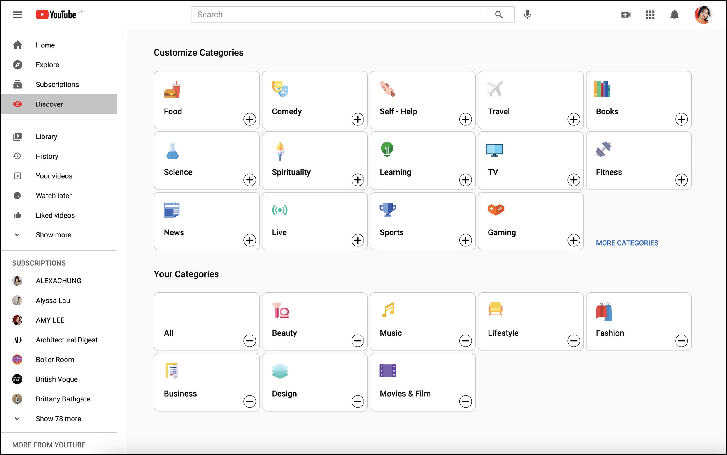
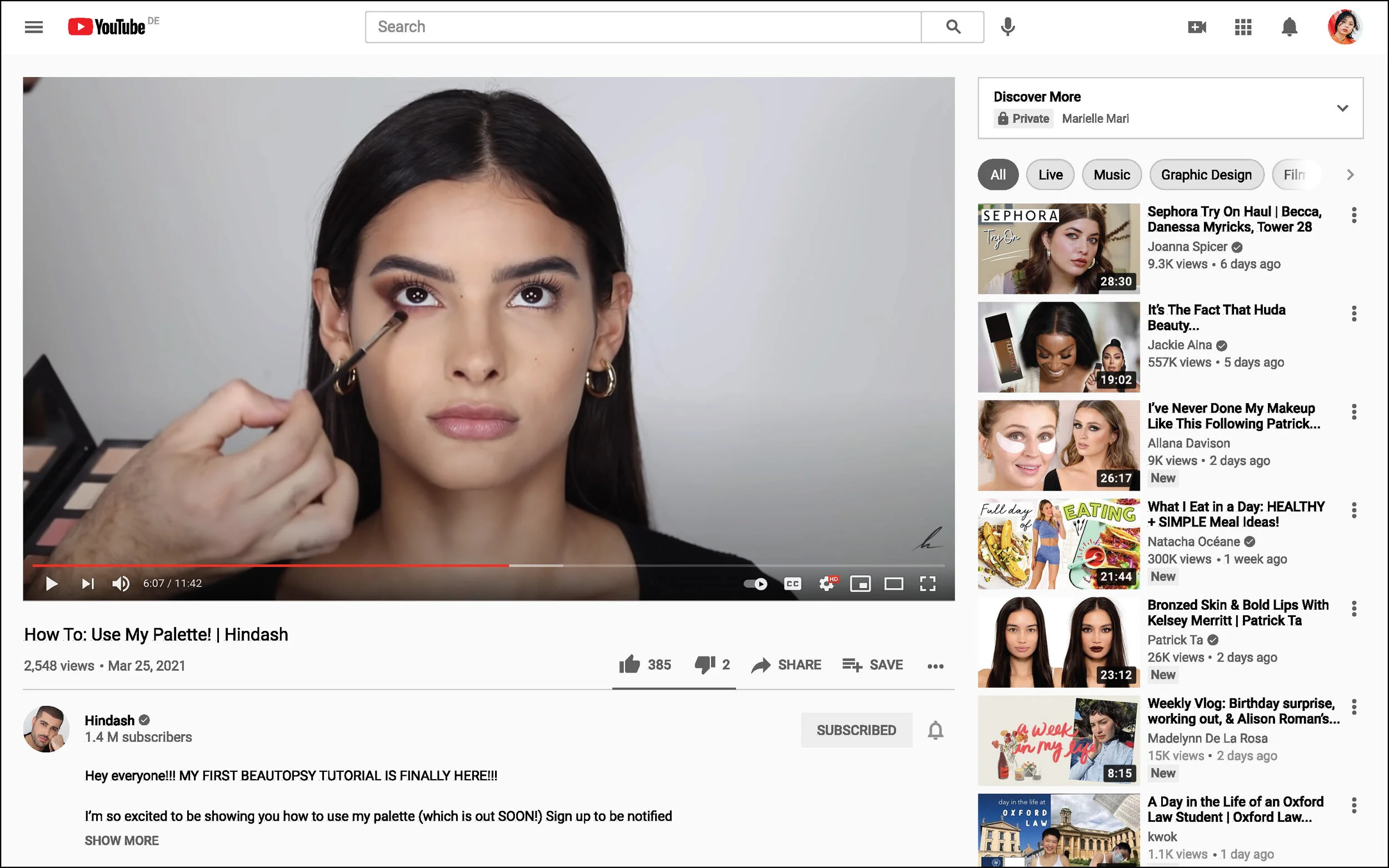
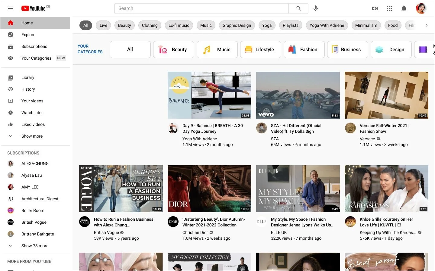
The ‘Your Categories’ feature enables users to customise their feed based on their interests.
YouTube ‘Your Categories’ Feature
YouTube, is a leader in the video streaming industry. YouTube enables users to share, view and engage with video content. Although they are leaders in the industry they are looking for ways to increase their viewer engagement. The purpose of this project is to create a new feature that will enable users and viewers to further engage with the YouTube community. To create a new feature that offers users a more immersive community experience that is in line with their existing brand identity.
My Role
User Research, UX Design, UI Design, Branding, Prototyping, Testing and Implementation
Duration
4 weeks, 80 hours
Tools
Figma, Maze, Google Forms
Empathize
To discover what additions could be made to YouTube in order to increase user engagement
To identify gaps in the platform’s engagement performance
To discover why users are choosing alternative video streaming platforms over Youtube
Survey Findings
Methods
Online Survey with Google Forms
13 participants
Youtube users
Goals
To find out how users engage with Youtube
How does Youtube perform against other video streaming platforms?
What features would improve viewer engagement?
Insights
Most users are unsatisfied with Youtube’s organization.
Most users are unsatisfied with their recommended content.
Users expressed a need for a better Explore page, with content specific to users watch interests and a feed more unique to them.
User Interview Findings
Methods
Video calls
3 participants
Youtube users
Goals
To find out users habits and behaviours when using Youtube
To find out what features are frustrating to users
What do users feel is missing?
Insights
Users want a recommended feed that is curated to allow for an easier browsing experience.
Users want personalisation of content, with the ability to customize content to their interests.
Participants want some indication of the quality of the content and its relevance to their interests.
Define
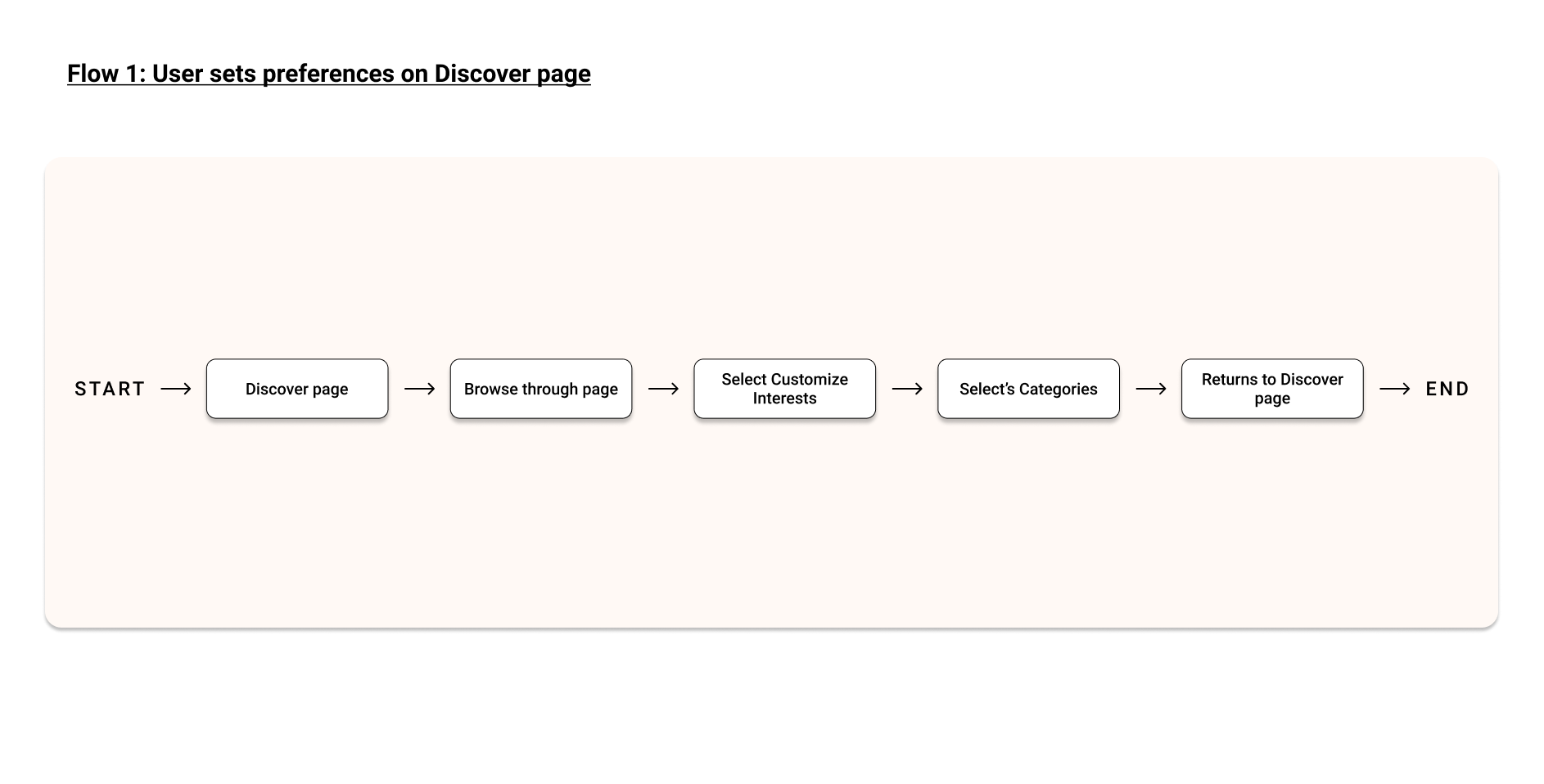
Now that I had a better idea of users needs, frustrations and motivations while using YouTube, I could apply this information to start defining this new feature. My approach was iterative, starting with the information taken from the research phase and applying it to the user persona, the sitemap which evolved while developing the feature, the priority features, and the user’s journey (based on the ideal user). These stages all came together to inform the new feature.
Ideate
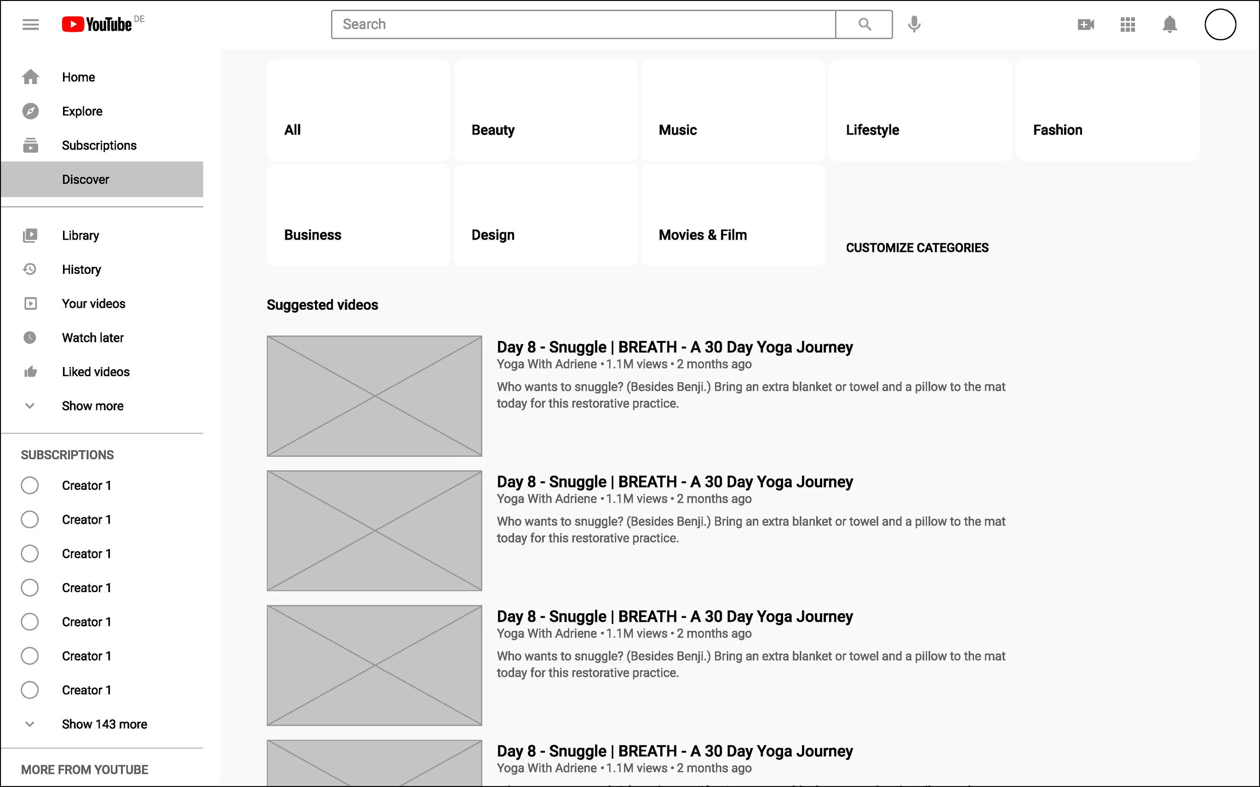
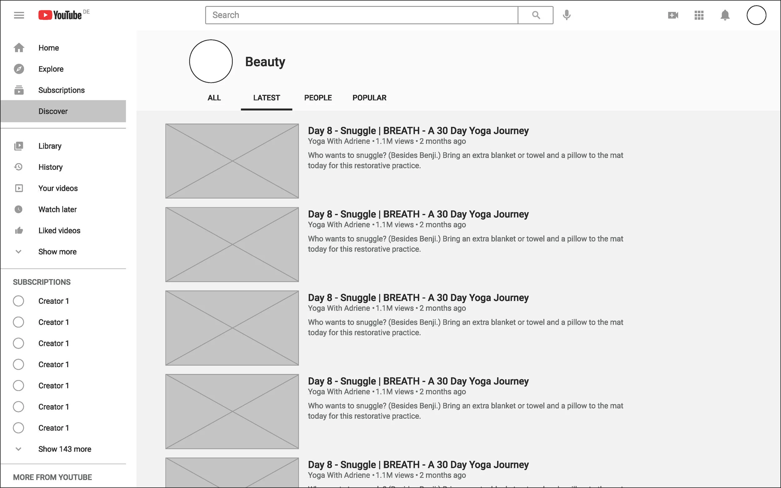
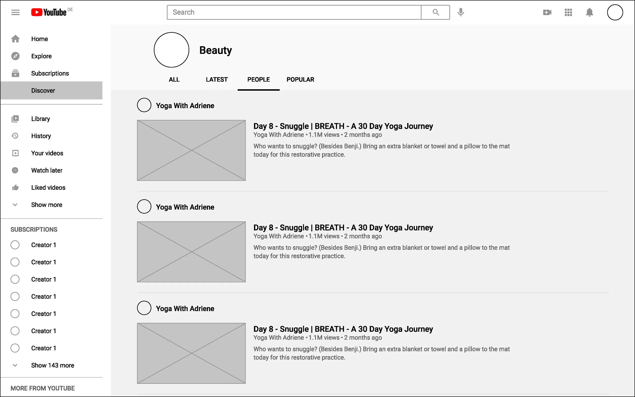
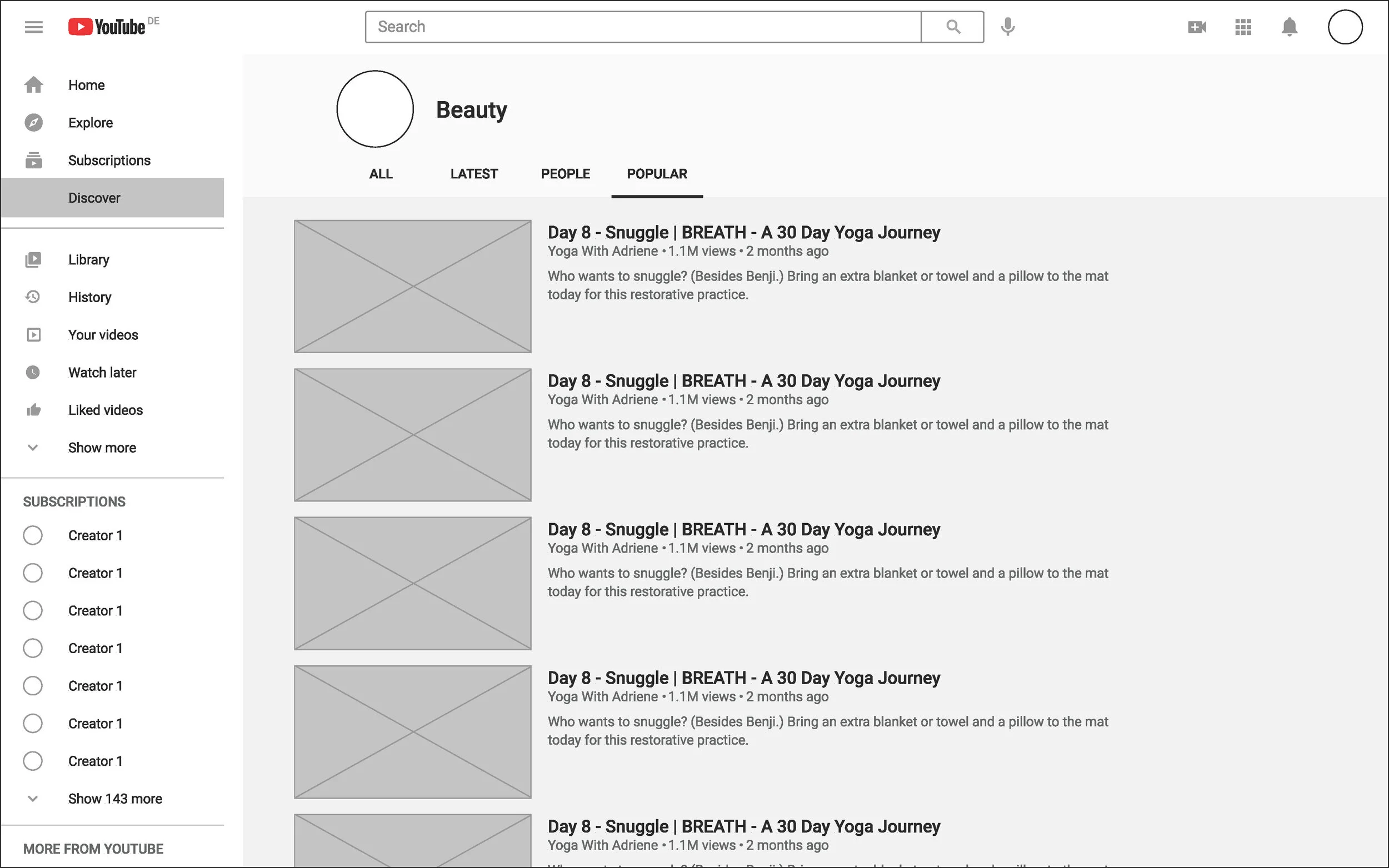
It was important at this stage in the design process that I maintained YouTube’s existing branding. The goals of this feature were to create something that was; easy to use, would allow for further engagement, in line with Youtube's existing brand identity and UI, also accessible to longtime users and newer users. Using tools like inspect kept design elements and colour palettes cohesive throughout. The sketches previously mapped out meant that building out the wireframes was a straightforward process, with the design staying in line up until this stage. The UI designs immediately came together when the icons, colour, and images were added to the mid-fidelity wireframes, creating an experience that really felt in line with YouTube.

Homepage
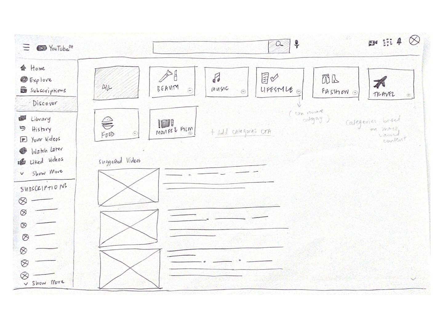
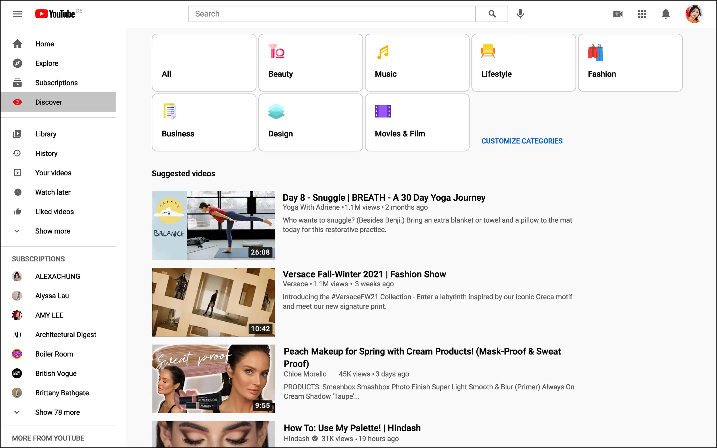
Discover Page
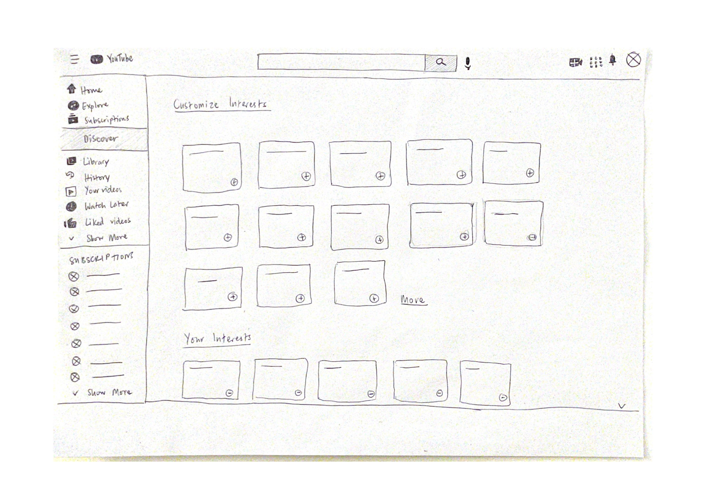
Customize Page

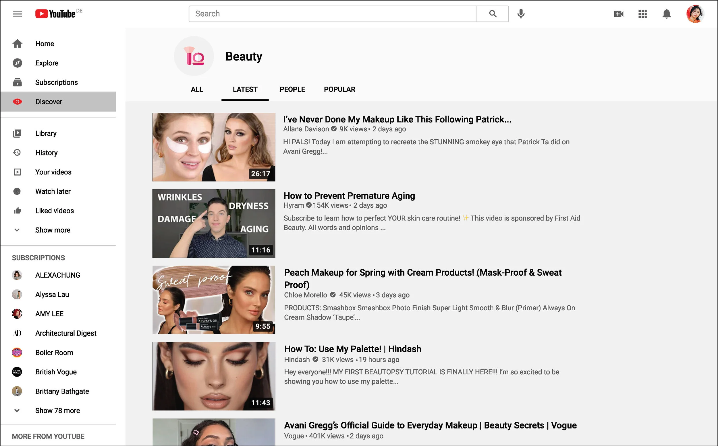
Category Page

Video Page
Wireframes
Prototyping
At this stage, it was time to test the new feature with a high fidelity prototype. I used the remote testing tool Maze, which allowed for a larger pool of test participants. This was an important step in order to receive thorough feedback as to the success of the feature and its potential frustrations.
Usability Test Findings
Method
High-fidelity wireframes
Virtual testing using Maze
11 participants
Unmoderated
Goals
Users are able to complete tasks with minimal difficulty
Users understand the new feature
To identify any users frustrations with the new feature
Tasks
Users find relevant videos through the Discover page
Users are able to customize their Discover page categories
Users open the Discover More feed embedded on the video page
Insights
Users found the main pages were easy to navigate.
Additional context would allow for users to better understand the new feature.
There was a positive response to users being able to customize interests on their ‘Discover’ page.
Unclear prompts during the Maze test contributed to the majority of confusion.
High Priority Revisions
To change the new feature name from ‘Discover’ to ‘Your Categories’. chosen through an additional survey where a small number of usability testers were given a selection of alternative feature names.
Add ‘NEW’ label to feature to further distinguish addition of new feature tab to the menu bar. (Keeping in line with Youtube brand guidelines)
Improve readability of icons ie. increase the size of icons throughout the new features.
Improve discoverability of Your Categories embedded feed CTA.
‘Your Categories’ Feature
Conclusion and Learnings
The main challenge I faced creating this additional feature, was to better define the new feature so that new and existing users would have little trouble understanding it. Through usability testing, it was clear that the name ‘Discover’ didn’t create enough of a separation for the existing ‘Explore’ category. It was important that the name of the feature immediately gave users an understanding of its use, through an additional survey the name evolved to ‘Your Categories’ which spoke directly to the feature I had created, a place where users were able to customize categories based on their viewing needs. Ultimately, I feel that I was able to create a feature that would improve the users browsing experience, and also complement YouTube’s existing product.
Next Steps
Implement revisions based on additional usability testing.
Finalize designs for handover to developers.
Develop feature for mobile app.


