Kai Food Donation App
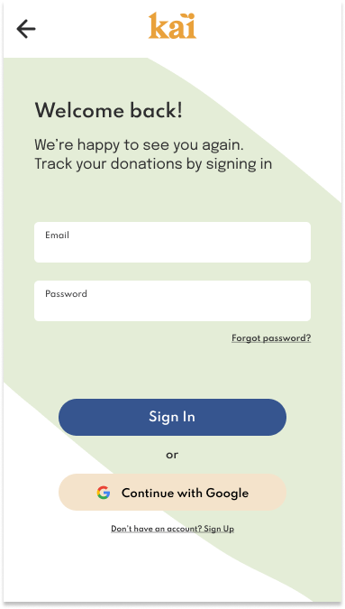
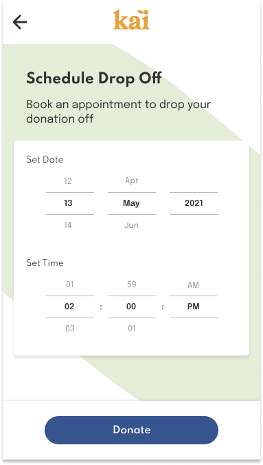
Kai is a startup concerned with food waste. This app was designed to enable individuals to better manage their food waste behaviours. Kai provides people with a way to redistribute excess food to those in need, in a timely, safe, and easy way.
My Role
User Research, UX Design, UI Design, Branding, Prototyping, Testing and Implementation
Duration
4 weeks, 80 hours
Tools
Figma, Maze, Google Forms
The Beginning…
At this stage, it is important to better understand our competitors direct and indirect, to discover how users currently make food donations, and what the related motivations and frustrations are. As well as, discover what values are important to users and how to deliver that in a mobile experience.
The Problem
“It can be difficult for young working people to make use of all their food items. Providing an informed and accessible service for individuals in similar situations to contribute extra food to those in need is the primary goal.”
HMW
“How might we create a donation experience that provides users with resources to tackle food waste, while also giving users access to organizations local to them thereby encouraging community engagement.”
Empathize
To conduct a competitive analysis on existing food donation apps.
To discover how users currently make food donations.
To discover what values are important to users and how to deliver that in a mobile application.
Survey Findings
Methods
Online Survey with Google Forms
9 participants
Those who have previously made food or monetary donations.
Goals
Have people previously used food donation apps?
What are people’s food donation habits?
What are the obstacles in the way of donating food and goods in general?
Insights
The main obstacles participants face when making physical donations are; discoverability, accessibility and location proximity.
Most participants feel that they are unable to find organisations local to them. With the majority of participants waiting till the opportunity to donate bulk goods arose.
Most participants mainly finding out about causes in need through; Instagram, family or friends, or simply word of mouth.
User Interviews Findings
Methods
Video/phone/email
4 participants
Those who make food donations more regularly.
Goals
What are users frustrations when making donations?
What motivates people to donate?
What do users want from a food donation app?
Insights
All participants value transparency from organisations, as well a clear donation path when making a contribution, monetary or otherwise.
With monetary donations being the most accessible to the majority of participants. With resources like GoFundMe providing contributors with personal narratives of those in need providing a personal connection and incentive to donate.
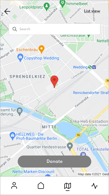
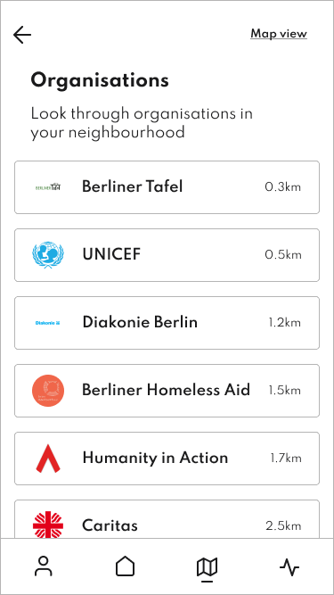
Users want to be able to see organisations local to them, encouraging people to engage with their community.
Define
After conducting; competitive analysis, survey, and user interviews I had enough feedback to understand users needs and frustrations when making donations and how competitors were attempting to solve these needs and frustrations. It was now time to make sense of this information, starting with defining the ideal user, defining the key features of the product, defining the structure of information and lastly, how an ideal user would make sense of the information architecture.
Ideate
This stage of the process came with a lot more learnings. Having now defined the main features and functions of the product, it was now time to make sense of all these components and build a product with the established features and structure. Keeping in mind the initial goal of the product, which is to provide users with a simple, easy to use product that connects users with organisations local to them. By creating a visual identity that is warm and approachable to encourage users to contribute to their local communities. From the ideation phase to the final donation path, this phase would bring to life a consistent donation experience.
Sketches
The main goal while sketching was to design the main screens, keeping in mind the main features of the app as well as the overall feeling of ease of use. From these sketches, it was time to move on to the overall branding of Kai - as friendly and accessible.
Wireframes
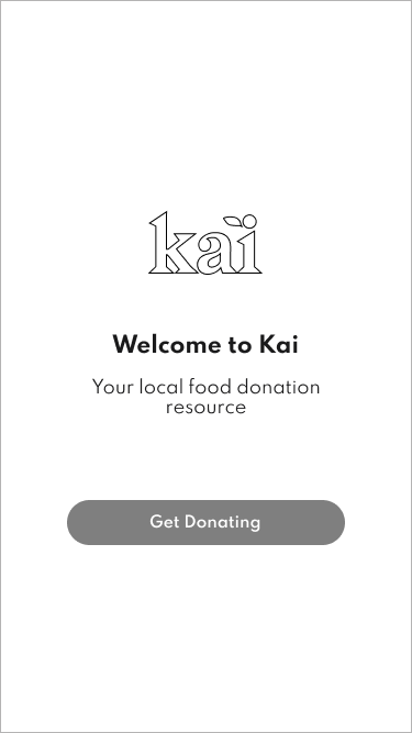
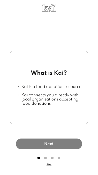
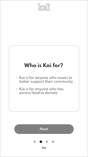
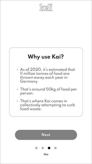
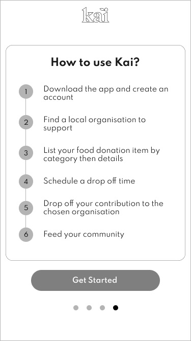
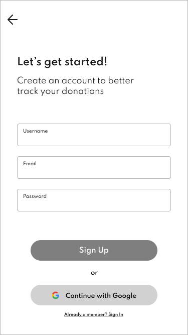
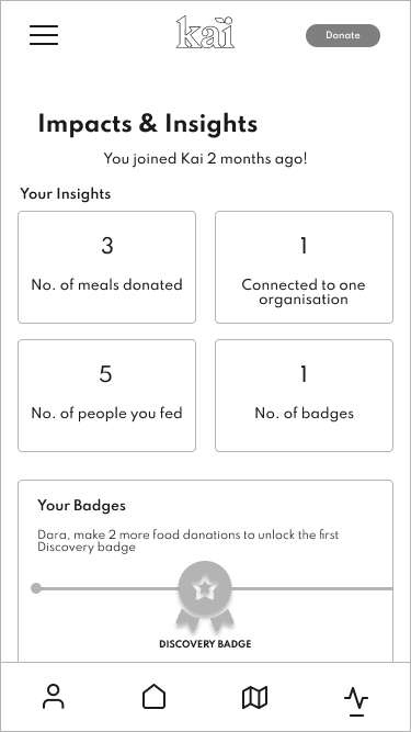
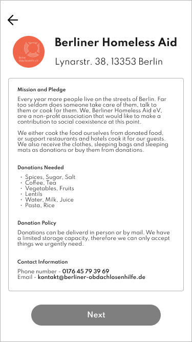
Low-Fidelity Wireframes
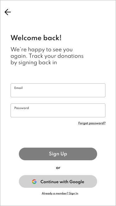
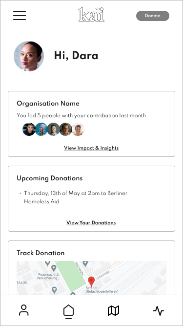
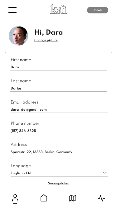
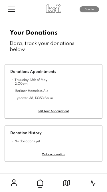
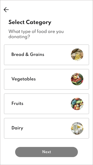
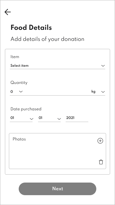
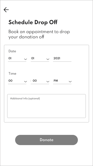
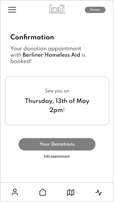
Prototyping
Now that the mid-fidelity prototype was at the testing stage, it was time to put the designs into the hands of its users. Testing on individuals who have made donations in the past and were interested in a tool or resource that made the donation experience smoother. It was important to create a test a prototype that allowed for exploration, where users were able to make donations through multiple pathways. The aim was to test its overall usability and the overall experience of using this food donation app.
Usability Test Findings
Method
Testing mid-fidelity wireframes
Virtual testing using Maze
7 participants
3 moderated tests, 4 unmoderated tests
Goals
To identify frustrations with the overall usability
To determine users understanding of key features
To complete usability tests on the prototype
Tasks
To set up an account
To set up initial donation and schedule a drop off appointment
To edit their donation appointment
To navigate from the ‘Homepage’, to ‘Impact & Insights’ page, to the ‘Profile’ page, then back to ‘Homepage’
Insights
Overall, tests showed a high completion rate, with multiple pathways to complete tasks.
Testers expressed that enhanced app visuals would add to a better user experience, including map visuals and larger text and buttons.
Onboarding information screens proved invaluable to testers as they provided users with better context to explore the app.
Most testers responded that they would find this app a useful donation resource.
High Priority Revisions
Enhanced visuals of apps overall branding and map visuals.
Increased text and button size for better app usability.
Refine scheduling pages to be more intuitive.
Refine some text fields and some labels to be more clear.
Conclusion and Learnings
The case of food waste is a large issue. This project attempts to empower individuals to connect and contribute to their local community. This application is a resource that makes food donation easy and accessible by providing users with a way to redistribute potential food waste.
One of the main challenges to creating this product was how to incentivise community members to donate, and minimizing the obstacles in the way of a donation experience. To tackle this, my aim was to create a design that would allow users to easily search for local organisations in their area, providing users with a clear list of an organisation’s policies and needs. As well, allowing users to input their categorized food contributions and to then secure a drop off appointment all help to simplify the donation process.
When it came to the design and implementation there were many things to consider. Readability was a primary concern. If users are unable to clearly navigate and understand the content, the product’s usability diminishes. It was also important to create a balance between the information and the visual language, to create a frictionless experience. These concerns all meant that creating multiple iterations, refining existing pages as well as adding pages as needed where necessary. An important step in assessing the overall usability of the product began with testing the mid-fidelity wireframes. This was accomplished by collaborating with potential users, enabling me to create a final UI design version that was seamless and most importantly had a favourable user experience. This project attempts to use design thinking to tackle food waste by providing users with a resource to engage with community members in need of support.
Next Steps
Implement revisions based on additional usability testing.
Finalize designs for handover to developers.
Develop a website for further discoverability of KAI.


