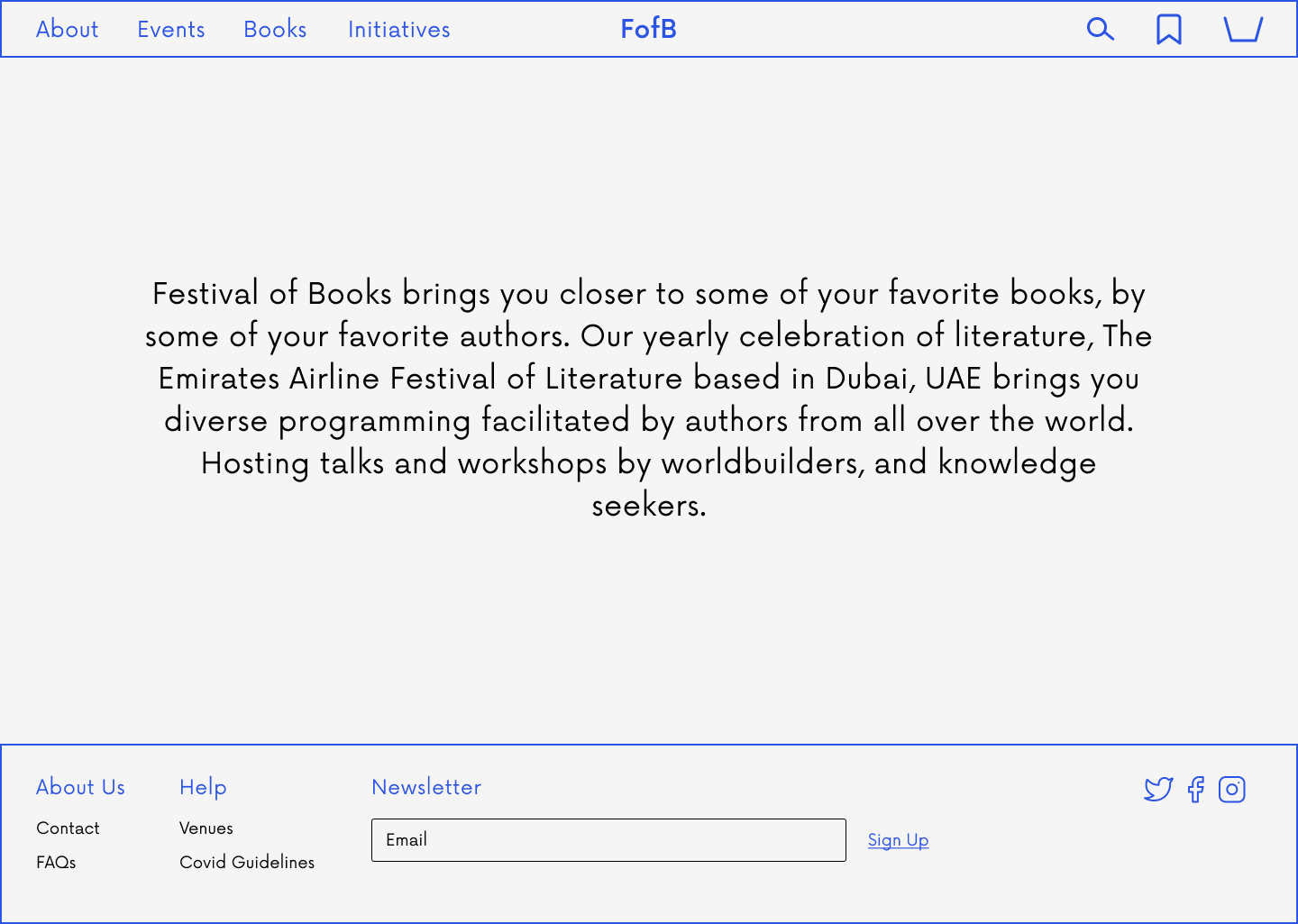
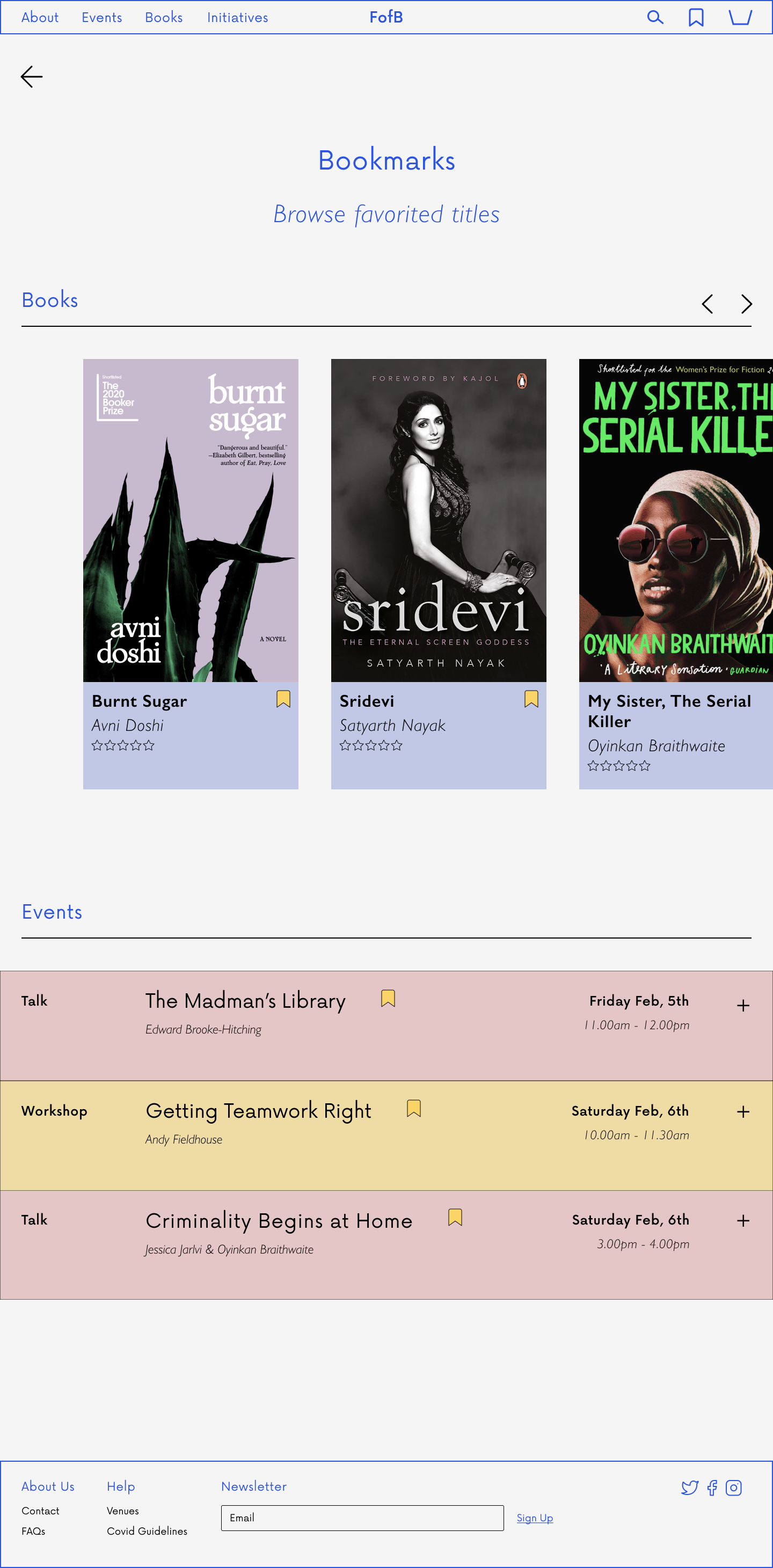
Rebrand - From Emirates Airline Festival of Literature to ‘Festival of Books’
Emirates Airline Festival of Literature is one of the leading literature festivals across the region as well as internationally. Based in Dubai, UAE, the festival focuses on the “celebration of written and spoken word…in all its forms.”
My focus was to redesign a responsive site and improve the websites usability, visual design, and overall experience.
Festival of Books announces upcoming literary events, including a selection of the festival headliners latest publications. It also provides ways for people to get involved with the event through sponsors possibilities as well as volunteering possibilities.
My Role
User Research, UX Design, UI Design, Branding, Prototyping, Testing and Implementation
Duration
4 weeks, 80 hours
Tools
Figma
Defining the Project
Goals
To improve user experience by enhancing navigation.
To improve overall discoverability of Emirates Airline Festival of Literature.
To encourage author engagement.
Problem
“When people look for cultural events in their area, it is important that they are faced with a simple and seamless browsing experience.”
Solution
It was important to deliver an event programming platform that is fresh and its navigation experience, seamless.
Empathize
To determine EAFL’s key features.
To determine how users discover cultural events.
To determine how users engage with cultural event sites.
The first step was to identify how competitors in the arts and culture space (in the region) deal with distributing a lot of information, as well as how they establish their branding.
After conducting a competitive analysis it was clear to see that most arts and cultural event sites have distinct visual identities, but struggle in maintaining consistent accessibility throughout their sites.
User Interview Findings
Methods
1-on-1 interviews
3 participants
Event-goers, bookworms, book enthusiasts
Goals
What are users event habits?
What do users want from a cultural event site?
How do users engage with cultural events?
Insights
Most users find out about cultural events through social media.
Users look for responsive websites, especially when browsing for cultural events through social media platforms.
Most users look for events hosted by their favourite authors, familiar names, and cultural figures. Even more so when seeking a cultural event to attend.
Define
Since I was dealing with a rebrand, it was valuable for me moving forward that I better understood from a users perspective what they find valuable in a cultural events site. Along with that understanding my competitors in the region and what they value. All in all this information would inform they key pages and the structure I would carry forward to the reimagined platform, as well as the potential in adding new features to maintain a users interest (from social media to browsing this event site).
Ideate
I now had a vision of the ideal user, the key flows and most importantly the information architecture. I now had to tackle the wireframing, and visual identity. This was the most challenging stage as the focus was balancing key information while developing fresh branding. Branding was important to keep users exploring and reading about their favourite authors and books. Information and entertainment were at play here.
Prototyping
This stage came with a lot of iterations. It was important from a user perspective that the navigation was seamless, the information digestible and the visual design in harmony. Like the initial user interviews it was important to test this initial design on event goers and book lovers to get a real sense of the successes and frustrations.
Usability Test Findings
Method
Testing high-fidelity wireframes
1-on-1 testing
3 participants
Goals
To identify user frustrations with; navigation and readability
To determine the understanding of the added feature
For users to successfully complete intended tasks
Tasks
Buy an event ticket
Find an event on the author page
Find a book through the explore tab feature
Insights
Specific readability and visual concerns were brought up. Important to users that there is visual consistency to better process/understand information.
Users were able to perform tasks with little instruction, and showed ease at navigating the site.
Users were drawn to the ‘Explore’ tab feature, allowing users to search for books by theme and author which also proved informative.
High Priority Revisions
Refocus landing page to be more reflective of improved user experience.
Enhanced visuals, to strengthen brand identity.
Refine colour choices to avoid clutter.
Refine text choices, to improve readability.
Overall refinement.
Homepage
Conclusion and Learnings
The Festival of Books project was something I was drawn to from the start, as an avid reader it felt like a challenge to create or think about a resource that hadn't considered the focus of its platform being authors and their work, or at least in a way that I had come across.
This project was not without setbacks, initially my intention was to stick to redesigning an existing literary event platform, but it was clear at closer to completion that that would not be enough to draw users in. It was important that I added features that would encourage exploration, and that users would want to stay on the site for longer as the site mostly served the purpose of annual event programming.
Overall, there seemed to be a demand for this type of platform, a resource that would bring users closer to their favourite authors, and through literary events hosted by those same authors. I think this product has potential to become a resource and tool to bring readers into the world of their favourite creators.
Next Steps
Conduct usability tests based on improved UI designs.
Hand-off designs to developers.
Continue to develop responsive pages for tablet and mobile.


