Miro Home Interiors
Miro has been a successful furniture store for a few years now, with two stores in Berlin, Germany and a third looking to open in the new year. Their extensive collection of vintage and contemporary furniture pieces have made them a name among interior design lovers. Their newest challenge though has been their transition to e-commerce. This is where we come in, the goal here being to update their outdated logo, and build them a responsive e-commerce website. In turn, boosting their sales and their international presence.
My Role
User Research, UX Design, UI Design, Branding, Prototyping, Testing and Implementation
Duration
4 weeks, 80 hours
Tools
Figma
Empathize
To determine what features Mirror needs in an online shopping experience.
To determine users needs and wants in an online shopping experience.
How will the in-store shopping experience differ from the online experience?
Are users looking for an innovative online experience or do they prefer a more traditional online experience?
Initially, the intention was to reimagine an e-commerce retailer that sold everything from clothing to home-wear. After initially looking at various e-commerce clothing competitors it became clear there was a generic formula when showcasing a massive amount of goods. It became important to instead build an e-commerce site with a product focus. So instead I decided to pursue the route of a curated selection of homeware goods.
User Interviews Findings
Methods
Phone calls
3 participants
Online shoppers
Goals
To identify online users shopping habits
To discover users needs and frustrations when shopping online
Insights
Online shoppers look for intuitive navigation features; cart, search, filter, hamburger menu, breadcrumbs, predictive check out.
Participants expressed a need for a mobile friendly shopping experience.
Clear, high quality product merchandising.
Define
After identifying some competitors key UI features that were used throughout their e-commerce sites and speaking directly to users and identifying their needs. I was now able to establish both the users priorities when shopping, as well as, e-commerce standard practices to then be able to begin defining the sites features and its target user.
Initially, this user persona was reflective of the ideal user of a e-commerce clothing site. As the focus of the project evolved to an home interior e-commerce site, it was clear that this user persona would only partially fit the new focus. What did become clear as a result of this user persona was that the ideal user for Miro Home Interiors would value a high quality service, with curated collections, and a responsive design.
Ideate
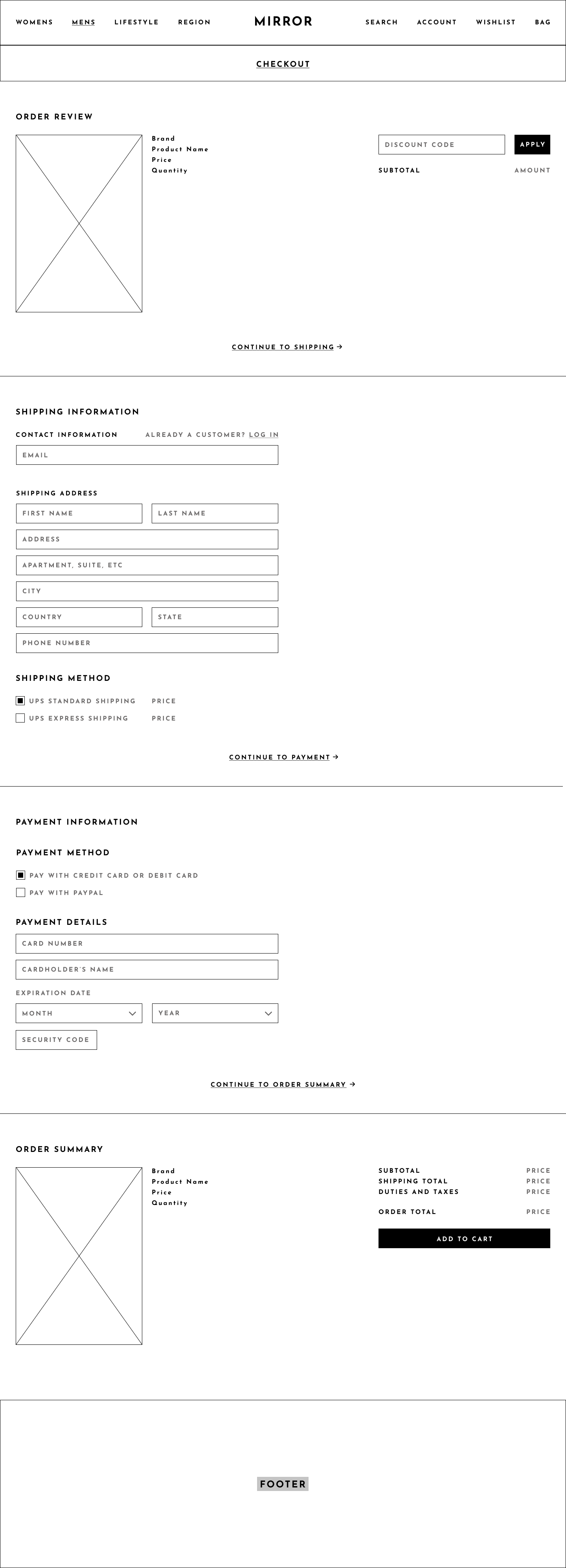
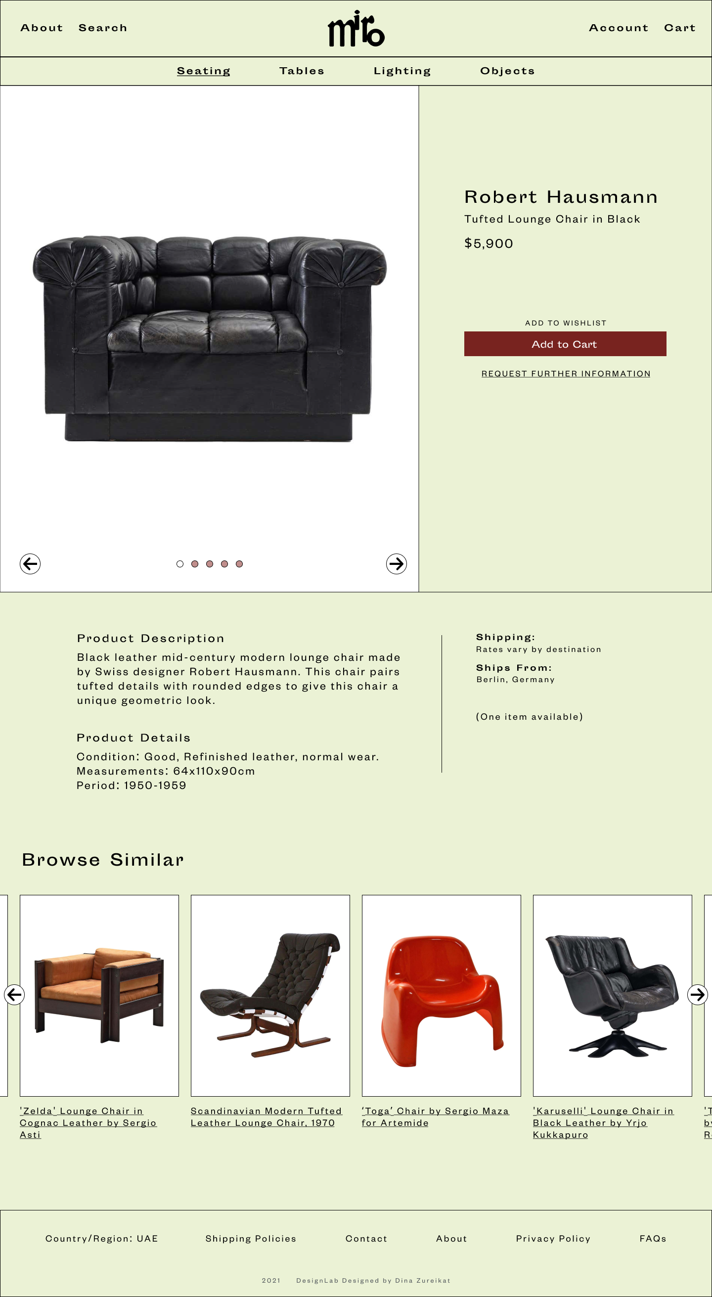
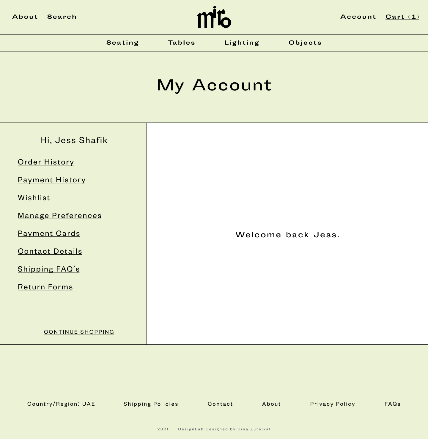
The key user had been defined, the key use cases identified and the sites main pages established. Now that the site has been defined it was time to put together the sites visual identity. It was important that the website had quite a simple formulaic layout, but playful with visual details like the Miro brand logo, the colour scheme, product imagery and typography.
Wireframes
Prototyping
It was now time to test the site, and identify any user frustrations. An important stage of the design process in order to establish any issues with the overall navigation to identifying any accessibility issues with the design choices.
Usability Test Findings
Method
High-fidelity prototype
4 participants
Video call
Goals
To identify any frustrations while completing tasks
To determine if users have an enjoyable navigation experience
Tasks
Buy a Product
Create an Account
Insights
Users found that the overall website branding and product choices were well balanced and created a harmonious browsing experience.
Intuitive navigation, meant that all participants were able to successfully complete intended tasks.
Users suggested minor improvements to the overall navigation. Specifically, a fixed order summary during checkout, and an arrow to remind user to scroll.
Conclusion and Learnings
With the initial intention of creating an e-commerce site, the motivation then became to adapt this formulaic approach to e-commerce and show product that was unique but was still presented in a language that online shoppers would understand. I ended up creating a brand and product that provided users with a unique product and a playful browsing experience.
The main challenge of this project was in maintaining standard accessibility practices while still creating an experience for users that was useful and playful.
Miro was a super enjoyable project, that enabled me to explore my own design interests while also learning and understanding some of the challenges that come with building an e-commerce site in an oversaturated market.
Next Steps
Implement changes based on further testing.
Finalize handover to developers.
Build out additional mobile responsive pages.


